Case study 01 · Designed & built
Foxed
Your reading, well-loved.
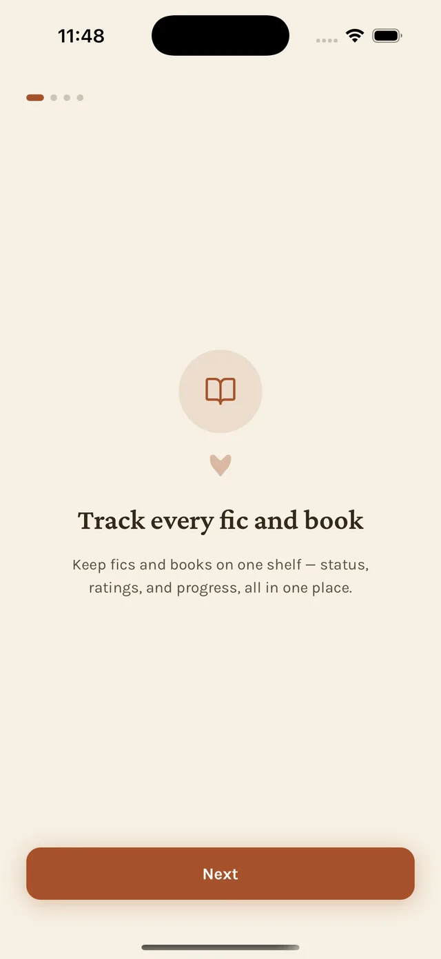
A fic-and-book tracker for readers who live on AO3, designed and built solo, end to end, with Claude Code as an implementation partner. Four months, 141 commits, one very opinionated idea about what a reading app should feel like.
- 141
- Commits
- ~4 mo
- Timeline
- Solo
- Team
- iOS
- Platform
- 9
- Themes
- 0
- Servers

The 30-second version
The problem
Readers who live on AO3 track progress across tabs, bookmarks and memory, and no tool treats a fic and a book as the same kind of finished.
What I did
Designed and built an iOS tracker with no accounts, no servers and no hosted story content, around one status model and a design system decided up front.
The result
In private beta on TestFlight with a handful of friends. Five decisions, below, shaped what it is.
01 · The problem
Nobody treats a fic and a book as the same kind of finished.
Readers who live on Archive of Our Own track progress across browser tabs, bookmarks, and memory. Readers who track books use Goodreads or StoryGraph. Nobody who does both gets to treat “I finished this” as one feeling, because no tool treats fic and prose as the same category of thing, even though emotionally they are.
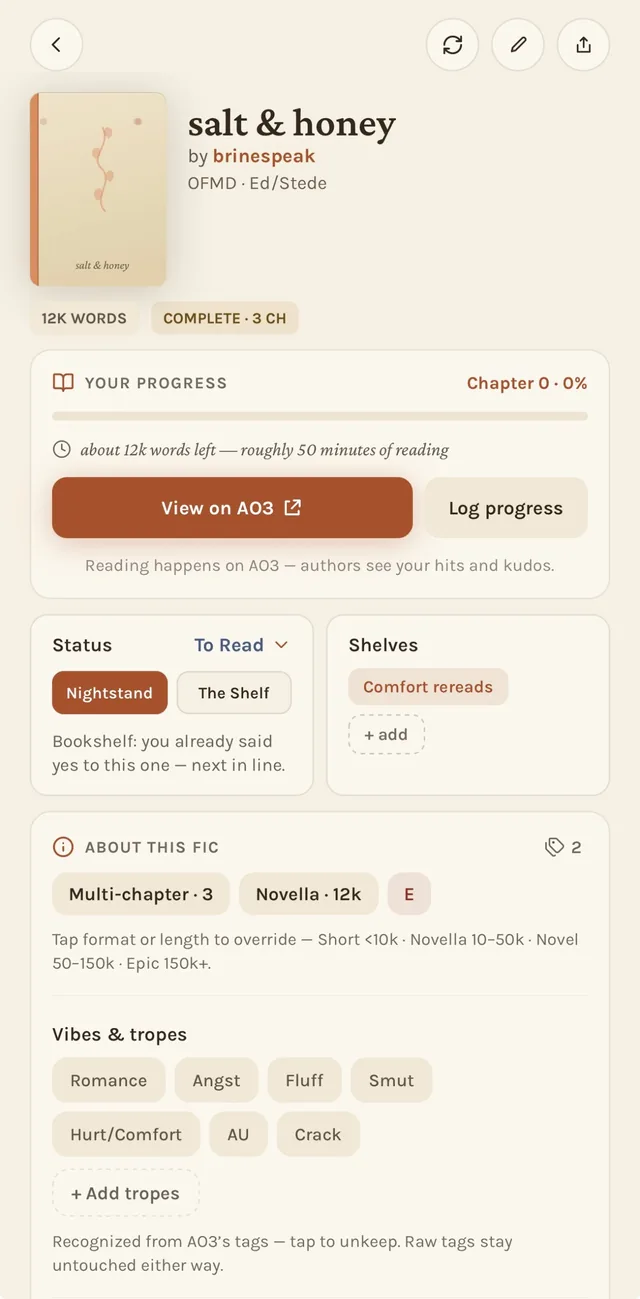
Worse, most tools that touch AO3 at all do it carelessly: scraping full story text, building a competing reading surface, or quietly forgetting that hits, kudos, and comments are how fan authors are paid.
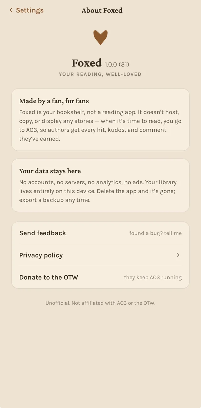
Foxed starts from a constraint, not a feature list. Design the whole product around what’s left once you take these off the table:
- Never host a word of story content.
- Never require an account.
- Never run a server.
02 · Design system
A system decided before a single screen was drawn
Foxed is built against one living reference doc (colors, type, iconography and voice) that has been revised more often than any individual screen. These are excerpts from the real thing, not a reconstruction for this write-up.
Palette: warm alphas only, never flat gray
App background
Primary actions, fic strip
Streaks, warnings, gold moments
Books, toggles-on
Generated covers
Text, via alphas
Type: two roles, never mixed
- Display
- Serif, for greetings and quiet moments of voice
- Buttons & emphasis
- Karla, 700
- Body & rows
- Karla, 400, cream at 85%
- Overline labels
- Tracked +14%
Voice
Warm, bookish, lightly foxy. Honest about AO3: reading happens on AO3, authors see your hits and kudos. Never corporate, never gamified-pushy, no exclamation-point pileups.
- “Here’s what the fox dragged in.”
- “Resting to stay under AO3’s radar.”
- “Your shelf is waiting.”
Icons & motion
- 24×24 grid, 2px stroke, round caps, exactly one rust accent per icon.
- No emoji glyphs in UI chrome (user content like shelf names is exempt).
- Quiet, paper-like motion: fade plus a 4–6px slide, 200–300ms ease.
- No bounces, no confetti. Haptics on status changes and streak moments only.
03 · Key decisions
The choices that actually shaped the product
Not a feature tour. These are the handful of calls where the obvious, easy version of the idea was wrong, and the real one took more nerve.
The Nightstand cap
Scarcity as a feature, not a limitation
Problem
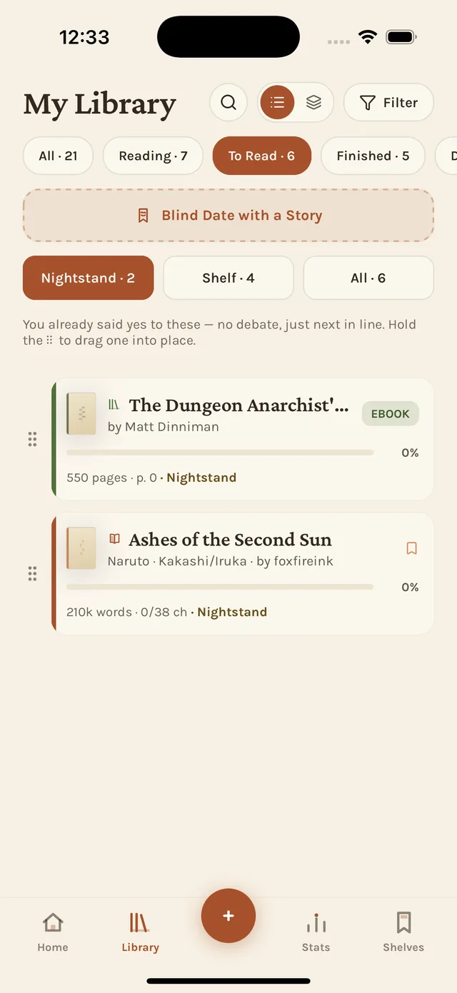
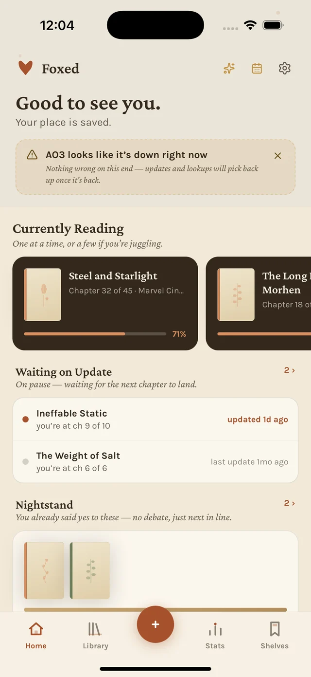
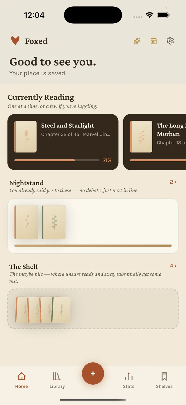
A “To Read” list is where good intentions go to die. Nothing stops it from growing to 400 items, and an infinite list applies zero pressure to actually choose.
Approach
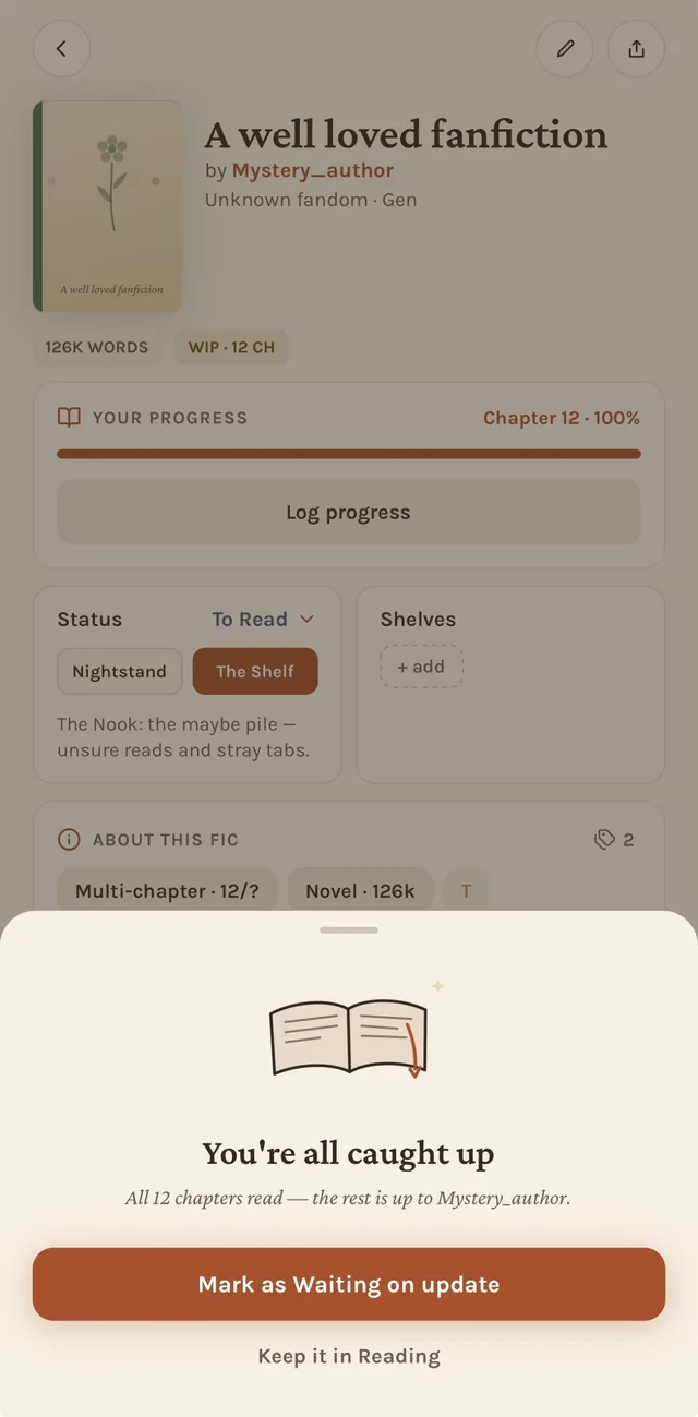
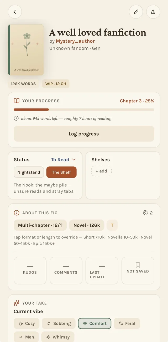
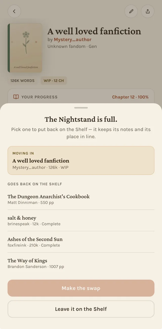
Split “To Read” into two shelves: a capacity-limited Nightstand (your real next-up queue: 8 by default, adjustable from 4 to 12) and a looser Shelf for “maybe someday.” Add a ninth book to a full Nightstand and nothing silently succeeds. A swap sheet opens, asking what comes off before the new one goes on.
Outcome
The decision happens at the cheapest possible moment, when adding one thing, instead of later, staring at an unmanageable pile. It also surfaced real engineering edge cases worth naming: a modal-presentation race that could silently swallow the swap sheet, and a capacity-check race when two adds landed in the same instant. Committing to a constraint meaning something is what made those bugs visible at all.
The Companion
A notes space that can’t spoil you
Problem
Long, multi-work series are exactly where readers want a running notes space, and exactly where showing the wrong thing at the wrong time does real damage.
Approach
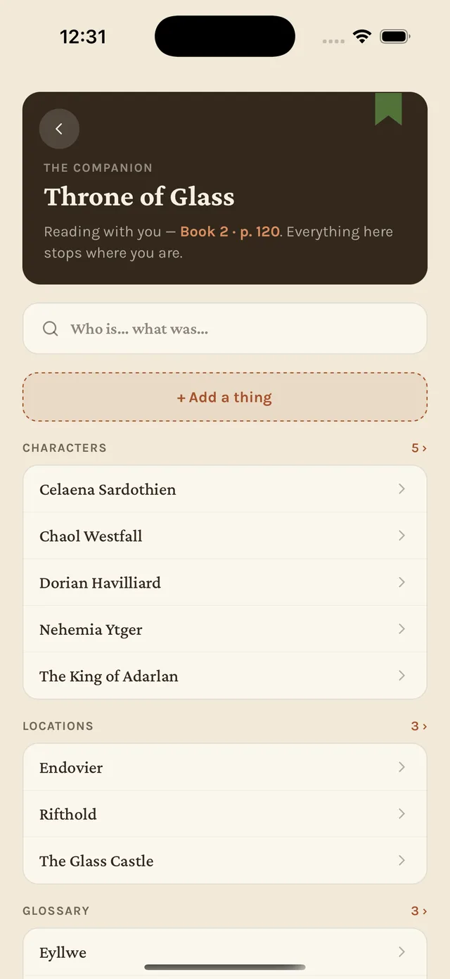
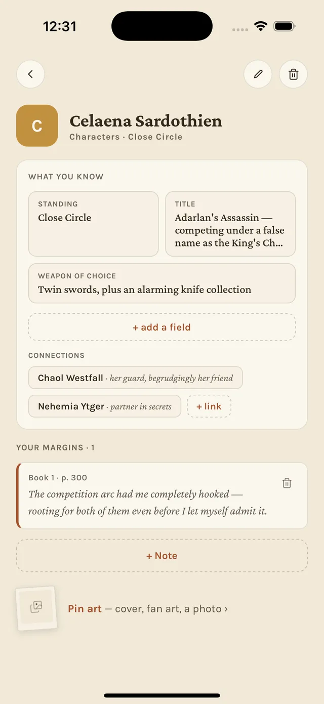
Every note, fact and connection in the Companion is stamped with the series position it was written at. The page only ever reveals what’s at or before wherever the reader currently stands, with no manual spoiler tagging. Categories aren’t pre-defined either: the app notices a reader has been tracking “characters” or “places” as the notes accumulate, instead of handing over empty buckets labeled in advance.
Outcome
A notes feature that works while a series is still unfolding, not only in hindsight after it’s finished. That is the harder and more useful version of the idea.
The celebration economy
Rewarding without nagging
Problem
Most reading-tracker gamification (streak flames, badge walls, reading challenges) reads as warm for a week and naggy for the rest of the year.
Approach
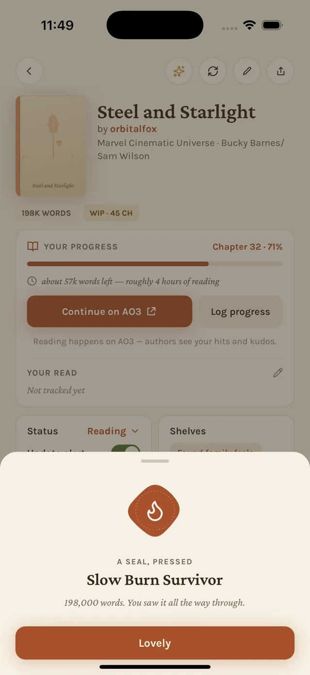
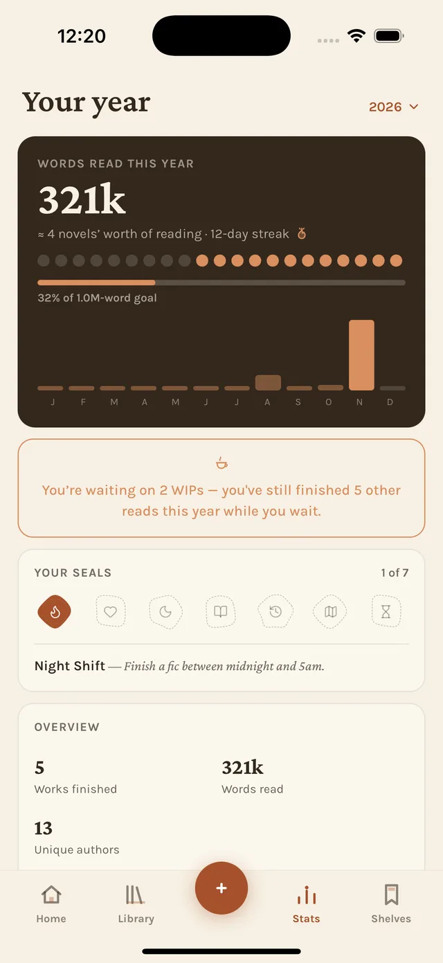
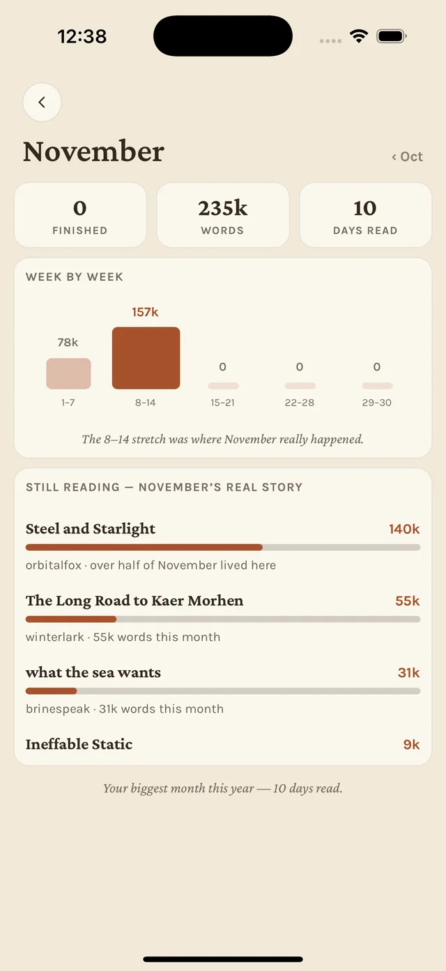
Every reward moment is tiered deliberately, by how often it should happen. Daily streaks stay almost silent: a calendar mark, with a “pressed leaf” forgiving one missed day automatically. Wax-seal achievements are rare and get the one genuinely animated moment in the whole app. A yearly Recap, in the style of a music-streaming “wrapped,” is the single big annual event. Nothing competes for the same moment twice.
Outcome
A reward system with a point of view about restraint, and a system that made room to remove a tier that wasn’t earning its place (see the last decision).
Reading Focus
One switch, not a settings maze
Problem
A reader who only tracks books doesn’t care about fandoms, ships, AO3 ratings or update alerts. The obvious fix, ten individual toggles, is its own kind of broken: a settings screen nobody actually goes and tunes.
Approach
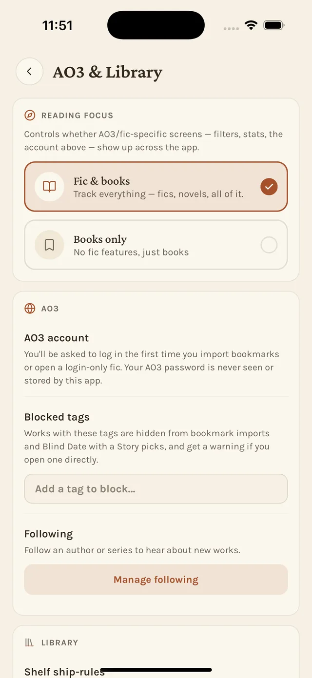
Reading Focus is a single switch. Flip it, and every AO3- and fic-specific surface across the entire app disappears at once: filters, stat cards, the favorite-tags widget, the AO3 footer link, the Waiting status. Flip it back and nothing was lost. It was all just hidden, not deleted.
Outcome
The inverse of feature-flag sprawl: one well-placed decision point instead of a dozen half-measures scattered through the app.
Cutting the Ink Cellar
Killing a feature without deleting it
Problem
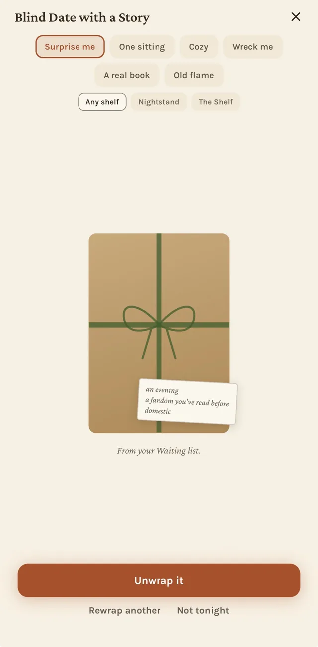
A word-count ritual, an “ink bottle” that fills as you read and corks at a milestone, collected in an “Ink Cellar,” shipped, got real use, and still didn’t feel load-bearing. It was competing for attention with the celebration moments that mattered more.
Approach
Instead of ripping it out, along with the data model, achievements and backup fields that had grown up around it, it got hidden behind a single feature flag. Every entry point (a Stats card, a celebration sheet, a Field Guide entry, a month-recap link) was gated off in one place, while the underlying word tracking kept running quietly underneath.
Outcome
Cutting a feature doesn’t have to mean deciding its fate forever, or throwing away data a reader already built up. If it’s ever worth a second look, flipping the flag back on picks up exactly where it left off.
04 · Process
Built solo, with Claude Code as the implementation partner
Every product call (what to build, what voice it should speak in, what to cut, what actually ships) was mine. Claude Code wrote most of the code, under close, continuous review, across roughly 140 incremental commits over four months.
One screen at a time, tested on a real device
Nothing shipped on faith. Every change was read, built, and actually used on a physical phone before it got pushed. The working rhythm was build, test, “push it,” never the reverse.
Bugs get fixed as a class, not a case
When one modal-presentation race turned up, the fix wasn’t just that one screen. It was auditing every root-mounted sheet in the app for the same mistake, and fixing every instance found in the same pass. The same discipline applied to a timezone bug in streak math and a stale-tier bug in the Nightstand logic.
Privacy as an engineering constraint, not a policy page
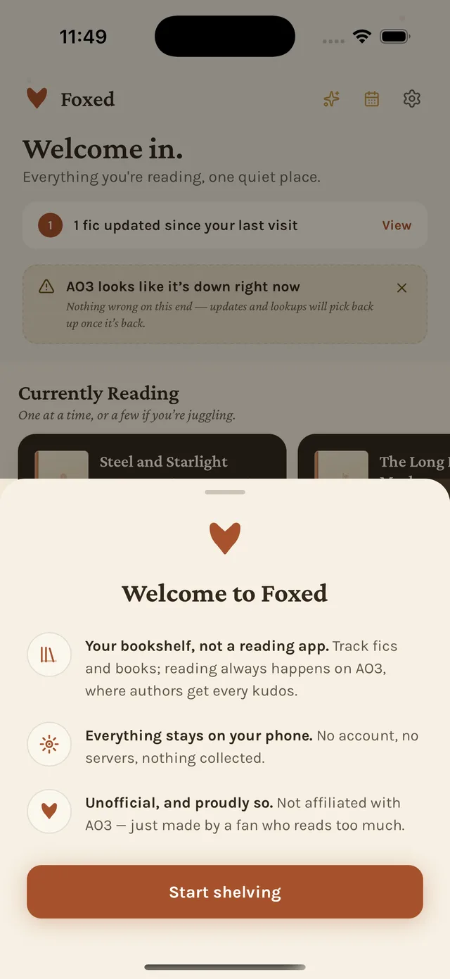
No accounts, no servers, and, deliberately, zero analytics or crash reporting. That tradeoff is real: it means a hand-run manual QA checklist is the only thing standing between a broken build and a friend’s phone, run in full before every share.
One living design doc, not tribal knowledge
Color, type, iconography and voice all live in a single reference file that every session gets pointed at first. A new screen gets built against the system, not improvised and reconciled later.
05 · Outcomes
What shipped, and what’s honestly still early
- Fic + book trackingOne status model, one celebration system, for both
- AO3 importBookmarks, series, and author/series following
- Goodreads & CSV importWith duplicate detection across and within files
- The CompanionSpoiler-safe notes wiki, per series
- Nightstand & ShelfA deliberately capacity-limited queue
- Background update checksReal notifications, opt-in, tied to the moment it matters
- 9 themes, 2 type pairsIncluding a true-black “Candlelight” mode
- Demo ModeShow the app without exposing a real library
Honestly: Foxed is in private beta, shared with a handful of friends via TestFlight. This isn’t a growth story with a user count worth bragging about. It’s a depth-of-craft one. The goal was never scale; it was building something specific and well-loved for people who actually live in this niche, including myself.
Next project