Case study 03 · Self-initiated concept
Petals-n-Glass
Flowers, gathered gently.
A self-initiated concept for a neighborhood flower boutique: the whole path from first browse to a placed order, designed for desktop and mobile, with a florist’s eye for how people actually shop for flowers.
- 19
- Screens
- 9
- Pages
- 2
- Layouts each
- 2
- Typefaces

The 30-second version
The problem
People shop for flowers for a moment, not a product, and florist sites often hand them a long grid and leave them to sort it out. The goal was a site for a small florist who relied heavily on Facebook to show her work. People now expect to browse and order online, especially when they are spending real money on flowers.
What I did
Designed nine pages in desktop and mobile, from an occasion-led home page through product, cart, checkout and confirmation, in a warm sage-and-terracotta system with two typefaces.
The result
A complete, clickable concept for one shop. It is a self-initiated design, not a live site, so there are no metrics to report.
01 · The problem
People shop for a moment, not for “flowers”.
A neighborhood flower shop sells things people rarely browse for fun. They arrive with an occasion: a birthday, a thank-you, a funeral, a wedding. The site starts from the occasion instead of a catalog.
This is a self-initiated concept, and I spent years working as a florist, so I designed it around the practical questions a customer has at the counter. The most common were whether we deliver and where, what certain sizes and services cost, and whether we could recreate an inspiration photo they had brought in.
The design works inside a few constraints:
- One small shop: ordering ends in pickup or local delivery, not shipping.
- Same-day matters: orders placed by 1pm can go out the same day.
- The phone is first-class: every page has a mobile layout.
02 · Design system
A small system with a florist’s palette
Excerpts from the design: sage for structure, one terracotta accent, and cream and sand as the ground.
Palette: sage, one warm accent, soft neutrals
Buttons, icons, active states
Text and headings
Eyebrow labels, hover, accents
Page background
Summary cards and notices
Image panels, step numbers
Type: a soft serif and a plain sans
- Display
- Fraunces Light, for headlines, prices and card titles
- Body
- Nunito Sans, 16–18 px, for everything else
- Eyebrows
- Nunito Sans Bold, uppercase, wide tracking, in terracotta
- Buttons
- Pills, 48–60 px tall
Voice
Copy sounds like a florist talking across the counter: warm and short.
- “Flowers, gathered gently.”
- “Tell us who the flowers are for and we will build something that fits.”
- “Fresh blooms are waiting.”
Rules the screens follow
- Tap targets are at least 44 px; most buttons are 48–60 px.
- Every choice that changes the order (size, delivery or pickup) is a real button that exposes its state.
- Fields have visible labels, not placeholders alone.
- Quantity changes announce themselves to screen readers.
03 · Key decisions
The choices that shaped the design
Not a page-by-page tour. These are the calls where the obvious layout would have worked less well.
Organize by occasion
The home page asks who the flowers are for
Problem
A flat grid of arrangements makes the visitor do the sorting.
Approach
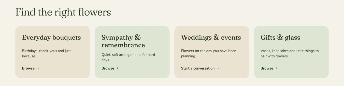
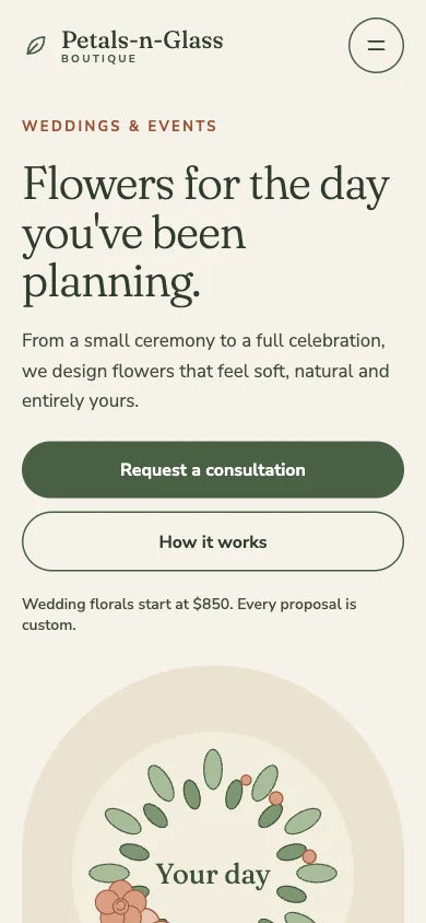
The home page leads with “Find the right flowers”: everyday bouquets, sympathy and remembrance, weddings and events, and gifts and glass. Weddings & Events and Gifts & Glass get their own pages and their own place in a four-item navigation.
Outcome
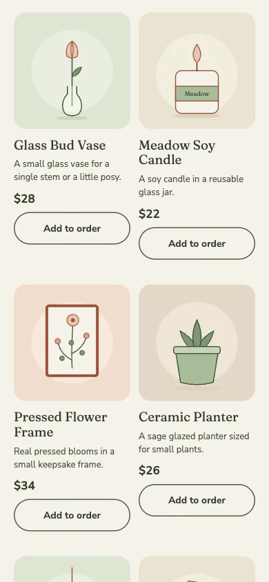
A first-time visitor can tell where they belong in one look, and the shop’s bigger services have a front door of their own. Weddings are a large part of the business and deserve space alongside other events. The shop also sells small items next to its larger services, so splitting the two keeps each easy to find.
Put the answers where the question comes up
Delivery, pickup and same-day timing before the button
Problem
Delivery cost and timing are often learned at checkout, a familiar reason people abandon an order.
Approach
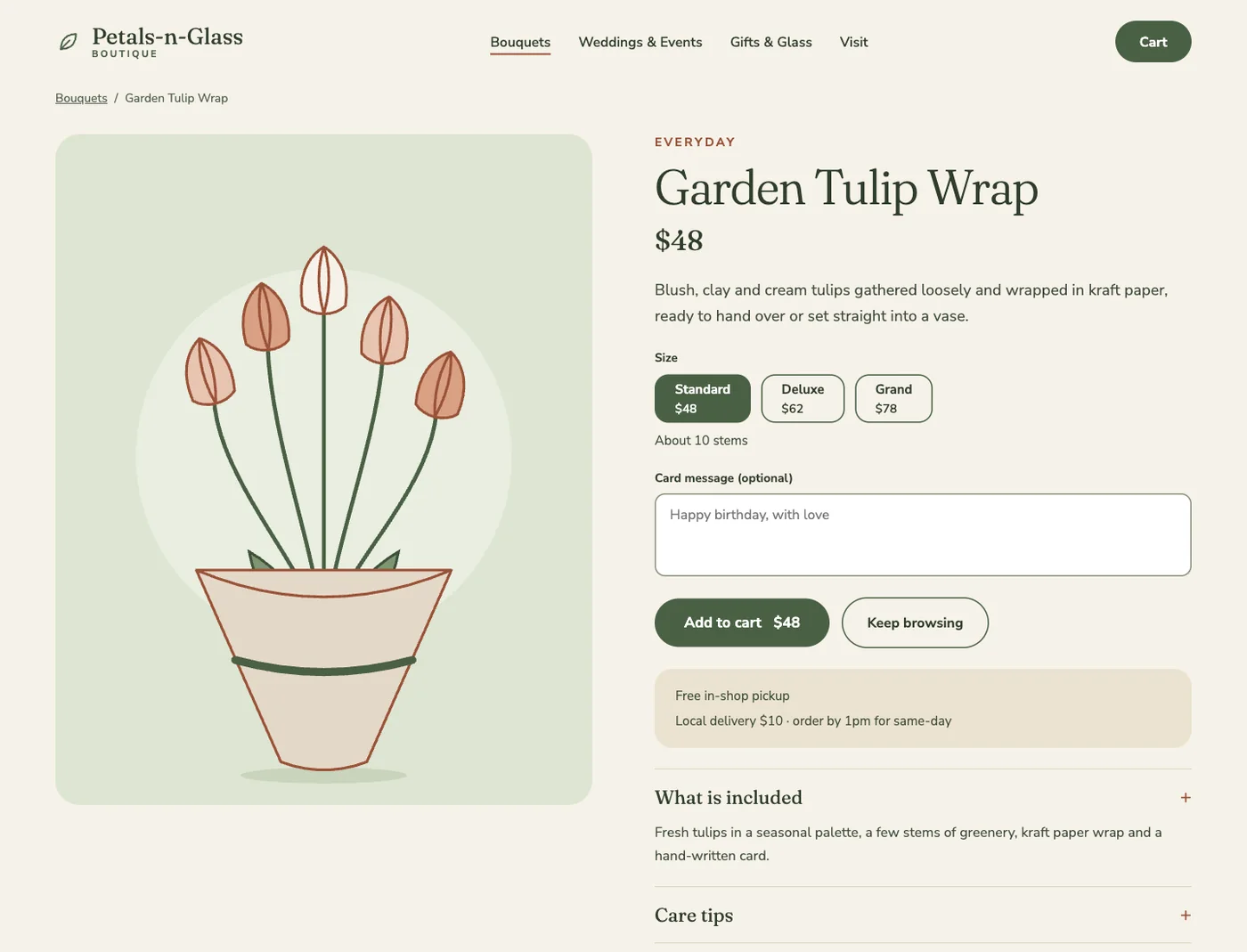
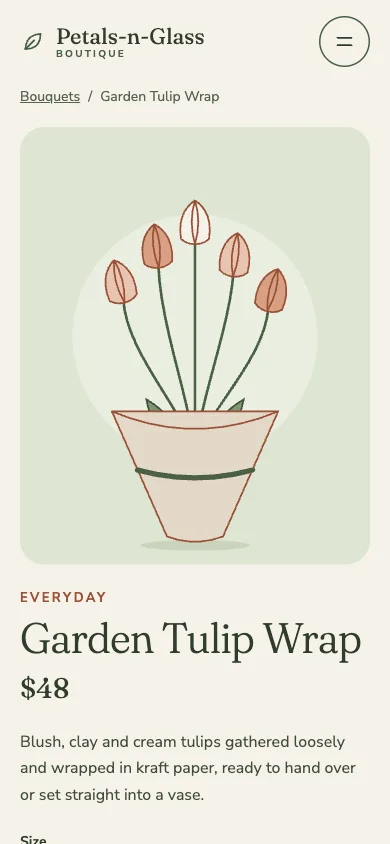
The product page says it before the button: free in-shop pickup, local delivery for $10, order by 1pm for same day. The cart repeats the delivery line and points to free pickup, and checkout turns the choice into its first question.
Outcome
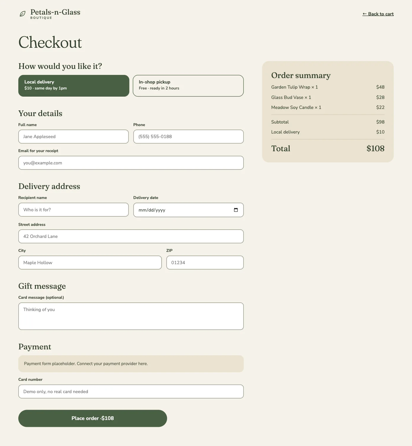
Nothing about cost or timing is a surprise by the time someone reaches payment. In the prototype the total moves from $98 to $108 as the choice changes.
One question changes the form
Delivery or pickup decides which fields appear
Problem
One long form asks pickup customers for an address they don’t have.
Approach
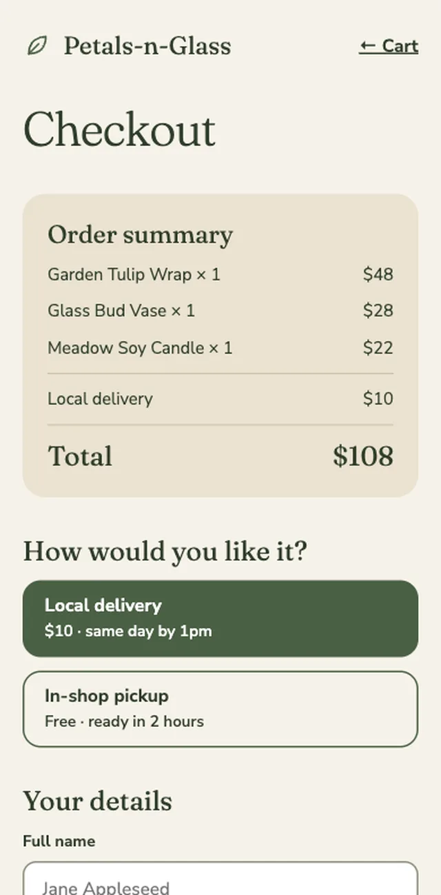
The first choice at checkout, “How would you like it?”, swaps the next block: recipient, date and address for delivery; a date and time slot for pickup. Details, card message and payment stay put, and the summary relabels its fee line to match.
Outcome
Each person sees only the fields they need, and a gift for someone else gets a recipient name and delivery date up front.
The phone gets its own front door
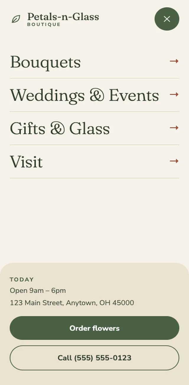
A mobile menu that answers “are you open?”
Problem
On a phone, the next step is often just to order or to call.
Approach
The mobile menu is full screen, with large links and a card pinned to the bottom: today’s hours, the address, and two buttons, Order flowers and Call the shop.
Outcome
The two most likely next steps are one thumb away from anywhere on the site.
04 · Process
How the work was shaped
Mostly a build-it-and-click-it approach, drawing on my own years of working for a florist. I first built a version of this as a college HTML and CSS project, and I know what people look for.
Started from a small sitemap
Four navigation items and a cart: Bouquets, Weddings & Events, Gifts & Glass, Visit. Everything else hangs off those.
Designed desktop and mobile together
Each of the nine pages has a desktop and a mobile layout, built from the same system so they stay in step.
Prototyped the buying path
The product, cart and checkout screens are interactive: pick a size, change quantities, switch between delivery and pickup, and watch the totals update.
05 · Outcomes
What it is, and what it isn’t
- HomeOccasion-led, with this week’s bouquets and a visit card
- Bouquets and productSizes with stem counts, a card message, care tips
- Cart to confirmationDelivery or pickup, live totals, a next-steps page
- Weddings, Gifts & Glass, VisitThe three pages around the shop
- MobileA layout for every page, plus a full-screen menu
Honestly: This is a self-initiated concept, so there are no users or sales to report, and the shop details are placeholders. It is here to show how I think through a whole buying path, from first browse to confirmation. With a real shop I would first test whether requesting delivery online works better than taking it by phone: does it help a very busy owner, or just give her a second place to check for orders? I would also verify that delivery windows and distances match the shop’s real location.
Next project