Professional work · Small project
A document portal for a health organization
A simple front end for seeing what’s required, what’s missing and what’s been added.
A regional health organization needed a simple front end where users could see which documents were required, spot anything missing, and upload or update files. I designed the layout for that experience, with a focus on keeping it clear and light on effort for the people using it. The client is kept anonymous.
The 30-second version
The problem
Collecting required documents means hunting for files, uploading them one at a time, and wondering what is still missing.
What I did
Designed the layout of a portal that groups required documents into collapsible categories, shows the status of each one, and lets users connect Google Drive so an AI agent finds their documents for them.
The result
A deliberately simple interface that shows users where things stand.
01 · The problem
Collecting documents is mostly hunting and wondering
Collecting required documents usually means people hunting for files, uploading them one at a time, and wondering what is still missing.
The goal was to make it easy to see what was needed and what was outstanding, and to cut down the manual uploading as much as possible.
02 · Key decisions
What I designed
Three choices shaped the portal, each aimed at saving users effort.
A list of accordions grouped by category
A short overview first
Problem
A long flat list of required documents is hard to scan and easy to give up on.
Approach
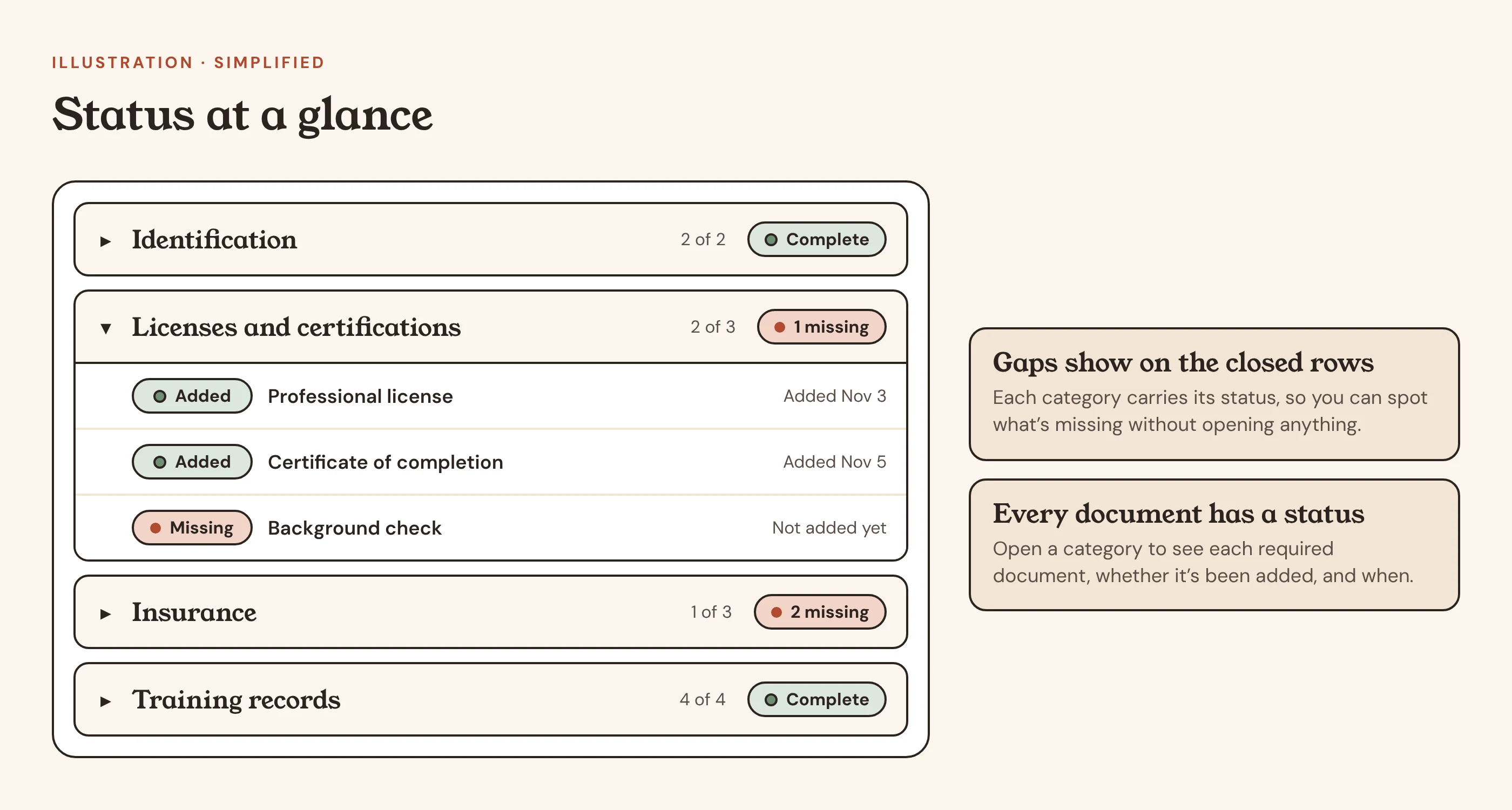
Required documents are organized into collapsible groups, so users see a short, scannable overview first and open only the section they need. Inside each group, the required documents are listed with the key details for each one.
Outcome
Users open only the section they need.
Status on every category and document
Gaps visible without opening anything
Problem
People are left wondering what is still missing.
Approach
Each category and each document shows its status, so users can tell at a glance what is still missing and what has been added, along with when it was added. The statuses on the collapsed groups mean users can spot gaps without opening anything.
Outcome
What’s missing and what’s done is clear at a glance.
A shortcut to skip the uploading
Connect Google Drive
Problem
Hunting down and uploading each file one at a time is the part people least want to do.
Approach
The main idea of the product is that users connect their Google Drive and an AI agent automatically finds the documents they need. A user just adds their documents to their Drive, and the portal picks them up. Users can still view, upload and update documents directly in the portal when something is missing or needs to change.
Outcome
Most of the manual uploading goes away, and the portal still allows direct changes.
03 · Process
How I approached it
This was a small project of about a week, and I designed the layout.
Start with what users need to know
Which documents are required, which are missing, and what has been added and when.
Let the AI do the heavy lifting
Because the agent finds the documents in Drive, the design didn’t need to be complicated.
Keep the interface deliberately simple
The design only needs to show users where things stand.
04 · Outcomes
Outcomes and what I learned
Honestly: What I’d point to is the approach: when the AI does the heavy lifting, the design’s job is to show users clearly where things stand and stay out of the way.
Next project